UI Enhancements
At Harbour Air, I help keep our website fresh and user-friendly through UI design, content creation, and regular updates. I design in Figma, work closely with our dev team, test new features, and pitch in on daily creative content to keep things looking sharp and on-brand.
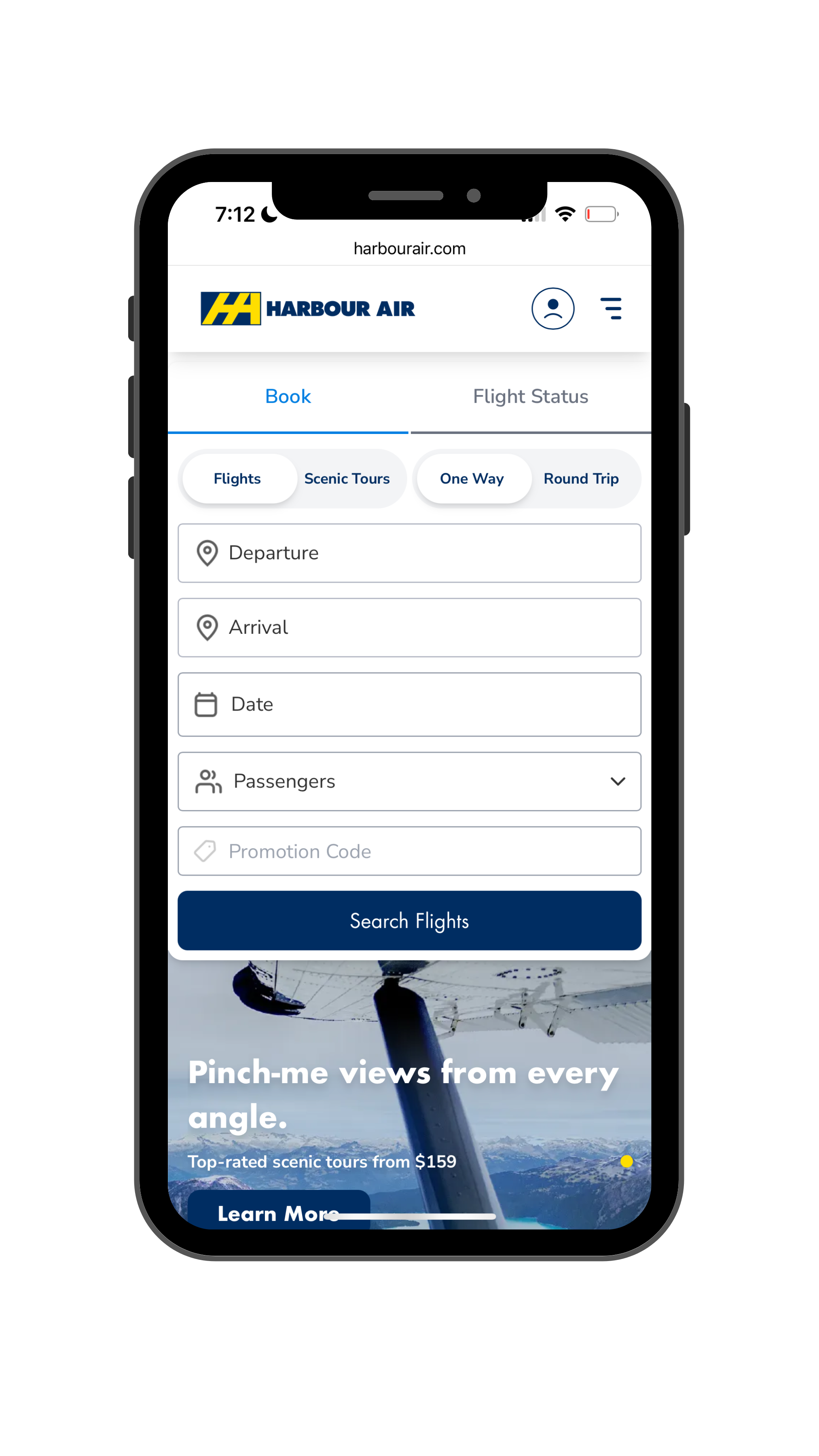
Booking widget user flow
This project focused on enhancing the visual and functional design of our existing booking widget, to make it cleaner, brighter, and more modern. A key addition to the booking flow was the introduction of a Lowest Fare preview calendar, which allows customers to easily view the lowest available fares by day and across an entire calendar month. This feature not only improves the user experience by simplifying fare comparisons, but also supports business objectives by increasing revenue, boosting fare awareness, and encouraging advance bookings to secure the best prices.
My Role was to design and prototype the UI using Figma, write documentation, monitor the implementation and user test each release.


PREVIOUS BOOKING WIDGET UI
Lowest Fare Calendar
The introduction of the Lowest Fare preview calendar addresses a pain-point where our users sometimes had difficulty finding our lowest advertised price. This new feature uses a “lowest fare” tag, which will highlight the lowest available fares within view. Additionally, this fare preview allows users to see that they can save money by booking their flights in advance. Encouraging advanced bookings is key to generating predictable revenue and this calendar update is an exciting improvement on the Harbour Air website.

Project objectives
To give the booking widget a cleaner, more polished look
Design a UI/UX flow for our Lowest Fare preview calendar
Allow customers to easily find the lowest daily fares, as well as sale fares, or our Everyday Low Fares
To consolidate and visually condense the mobile booking widget, allowing for more space to interact with the hero image and new mobile promotions component.

Promotions Component
In 2025, we added a promotions component to the Harbour Air homepage. The goal of this component is to highlight big sales or special offers. This component has the ability to be turned on or off, allowing other features to be highlighted when a promotion isn’t active.
On the mobile site, the Promotions component is condensed to a bottom tab. This prevents users from being blocked from viewing essential content such as the booking widget. When tapped, the promotions component swipes up from the bottom and directs users to the applicable landing page.

Previous Homepage Refresh
In 2021, I helped to refresh the overall UI design of the former Harbour Air homepage. The previous homepage was beginning to look outdated, the booking widget was difficult to use, and we wanted to reorganize how information was being displayed at first glance. I had the opportunity to provide feedback on the new site map, expand the booking widget to be more prominent, and produce a fresher, more cohesive look and feel.

Project objectives
The primary objectives of redesigning the homepage were as follows:
To enlarge and make the booking widget the primary focus
Separate Book Flight and Book Tour into their own tabs
Highlight promotional messaging above the fold
Reorganize site navigation
Modernize and highlight homepage categories
Create feature banner for HA Health First program

Previous homepage design
Note: This version of the Harbour Air website has been retired. The new website is now hosted on a headless CMS, rather than Wordpress.
Harbour Air
View additional Harbour Air projects including branding, campaign design and collateral design.